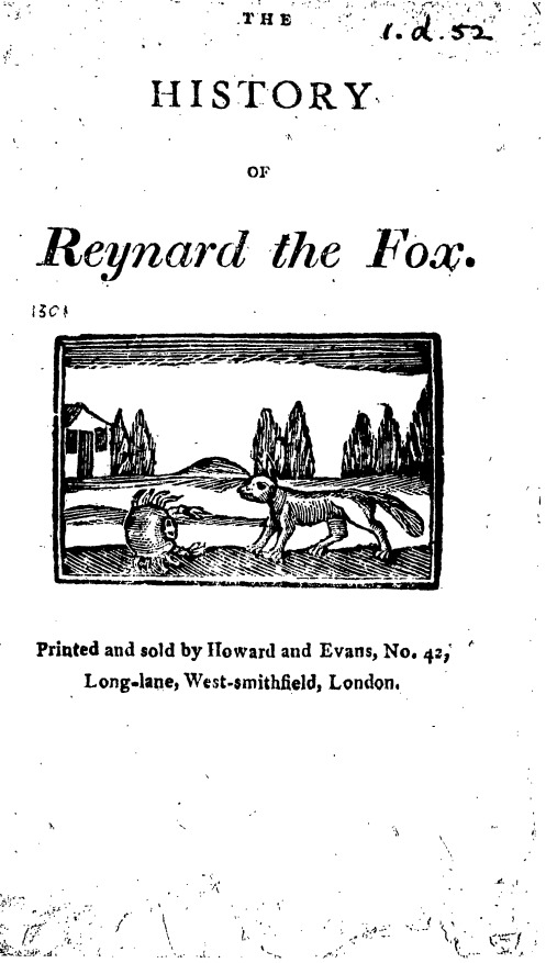
 Lets celebrate the new year with a text that is both old and new. I have chosen an 1800 printing (new at the time) of an age-old tale, Reynard the Fox. We have several versions of this text that stretch across the long 18th Century. The earliest version in 18thConnect, from 1662, bills itself as “newly corrected and purged from all grossness of phrase and matter.” Search 18thConnect for “Reynard the Fox” and sort the results by year to find this and all the other versions of the folktale, as well as numerous references to the Fox character, the fox’s general character, and other personages named Reynard and/or Fox — including some interesting political commentary.
The printed type is large and clear in this image, which minimizes the more common letter substitutions. Further, this printer has not used the “long s” or any ligatures that we found in the early 18th Century printing of “The Indian Emperor.” In many ways, this would appear to be an “easy” correction.
However, this text has some interesting contrasts to the earlier featured texts. The image scan of this particular version from 1800 has many extraneous marks, probably from ink-blots or other noise on the original pages, which make the OCR version of the text particularly messy. Besides the many obscured (and thus misread letters) in the OCR text, look for typed dots that appear before, within, and after the end of lines. I call these “dots” rather than “periods” because their position is unusual, being not at the baseline of the typed text, like a period would be, but along the midline (or median-line) of that line of text.
In other words, stay alert for this text can surprise its editors with its correction issues!
I hope you enjoy working on this example of folklore that has continued to live and breathe over the centuries. And please take some time to fill out our survey regarding your experience with the TypeWright editor!!
I remain your 18th Century Dilettante,
Anne Arundel